Posted on: November 16, 2020 | 4 min read
Data doesn’t lie but sometimes, it doesn’t tell the full story, either.
Breaking down and analyzing customer data based on cohort allows users to see trends that aren’t visible on the surface. Cohort analysis with Power BI is possible on even the simplest of data sets as all that is needed is a unique user or customer identifier and the date that the purchase, action, etc took place.
Using such a data set, cohort analysis can be easily visualized using most BI tools and is one of the most powerful ways to look at the strength of your company.
Cohort: What It Is
Simply put, a cohort is a group of people, such as users, customers, etc., with at least one common characteristic. In the context of business analytics, similar to a cluster, a cohort is a way of segmenting users into certain behavioral metrics.
Cohort groups are often based on:
- Date of First Usage
Example: Customers are grouped together based on what day/month/year they first purchased from the company. - A/B Testing
Example: Customers are grouped together by what version of an app they were first exposed to. - Referral Method
Example: Customers who were referred by Google Ads are separated from customers who were referred by social media or a friend.
Cohort analysis will allow you to compare these metrics over time to evaluate their performance.
Cohort Analysis: How
With a few simple, built-in functions in Power BI, you can complete a cohort analysis that then transforms this customer data into compelling visuals that can be explored, analyzed and shared – both on-site and remotely – all in one view with scalability, built-in governance and security.
Using this customer analytics technique, you can answer such questions no matter what industry you are in such as, ‘Over time, how do customers who first bought from us in our opening month compare to customers who first bought from us a year later?’ or ‘Do longer-tenured customers bring in more sales than newly acquired customers?"
Reading A Cohort Analysis
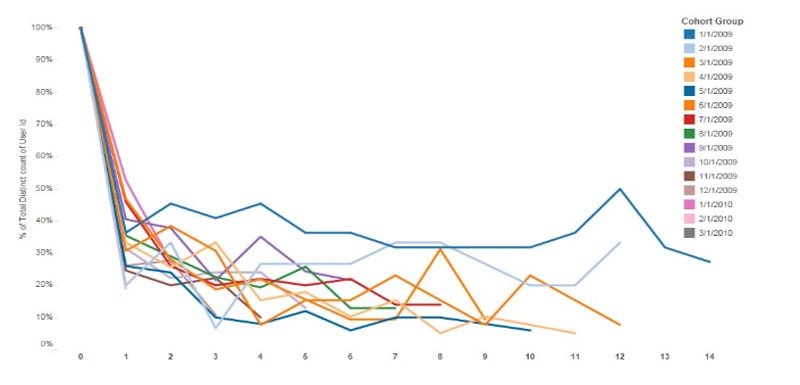
Cohort analysis is often visualized one of two ways: either in tabular form (often as a heat map) or as a line graph.
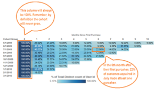
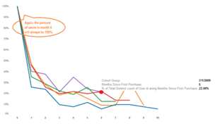
Unlike most tables which read left to right, a cohort chart should be read one column at a time, enabling you to identify possible disruptions in the user's life-cycle.
These disruptions can often be found as color gradients change in the same column, and the greater the difference between the gradients of color, the bigger difference between the two.
Cohort Analysis: Its Uses
To demonstrate how cohort analysis with Power BI can be useful, take the example of a start-up that is seeing a steady increase of active users over time. Using the visual below, the start-up may think they are in great health.
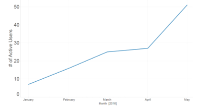
But if we perform cohort analysis, a whole different picture is painted.
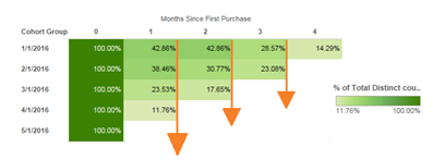
With this cohort analysis, the retention rate is decreasing for every new cohort, which means that although the company is seeing a steady increase in active users, the majority of these users are newly acquired.
The start-up may be able to get away with this in its nascent state but will likely soon have to focus its efforts on retaining current customers.
Some additional uses and benefits of cohort analyses with Power BI include …
- Improve Conversation Or Retention Times
Identify those actions which improve conversion or retention in order to decrease the time it takes to get newer users to take desired actions.
- Segment Customer Acquisition By Channel
Segment per-channel revenues in order to determine where optimization is most effective and where it needs improvement.
- Understand The Impact of Behaviors
Segment users by behaviors to ascertain a much clearer picture of how those users interact with your product.
- Improve Conversion Funnel Optimization
Determine how the user experience has impacted the conversion rate from the top of the funnel down.
- Identify User Engagement Issues
Uncover user-engagement issues by analyzing engagement in order to avoid mistaking growth for user experience optimization.
- Analyze Funnel Optimization
Determine whether or not funnel optimization generates more frequent purchases following initial purchase.
- Calculate Lifetime Value Calculation
Calculate an estimated LTV in order to determine the cost of customer acquisition and retention.
The key to effective cohort analysis with Power BI ultimately lies in the collection of accurate information. Armed with it, businesses can better understand the habits and patterns of their users for revelatory customer analytics that can propel your organization to the next level.
Written by CCG, an organization in Tampa, Florida, that helps companies become more insights-driven, solve complex challenges and accelerate growth through industry-specific data and analytics solutions.
Editor’s Note: The post was originally published in [September, 2019] and has been updated for freshness, accuracy and comprehensiveness.
Topic(s):
Data & AI
Return to Blog Home